Logo and Logo Guide

Logo Story
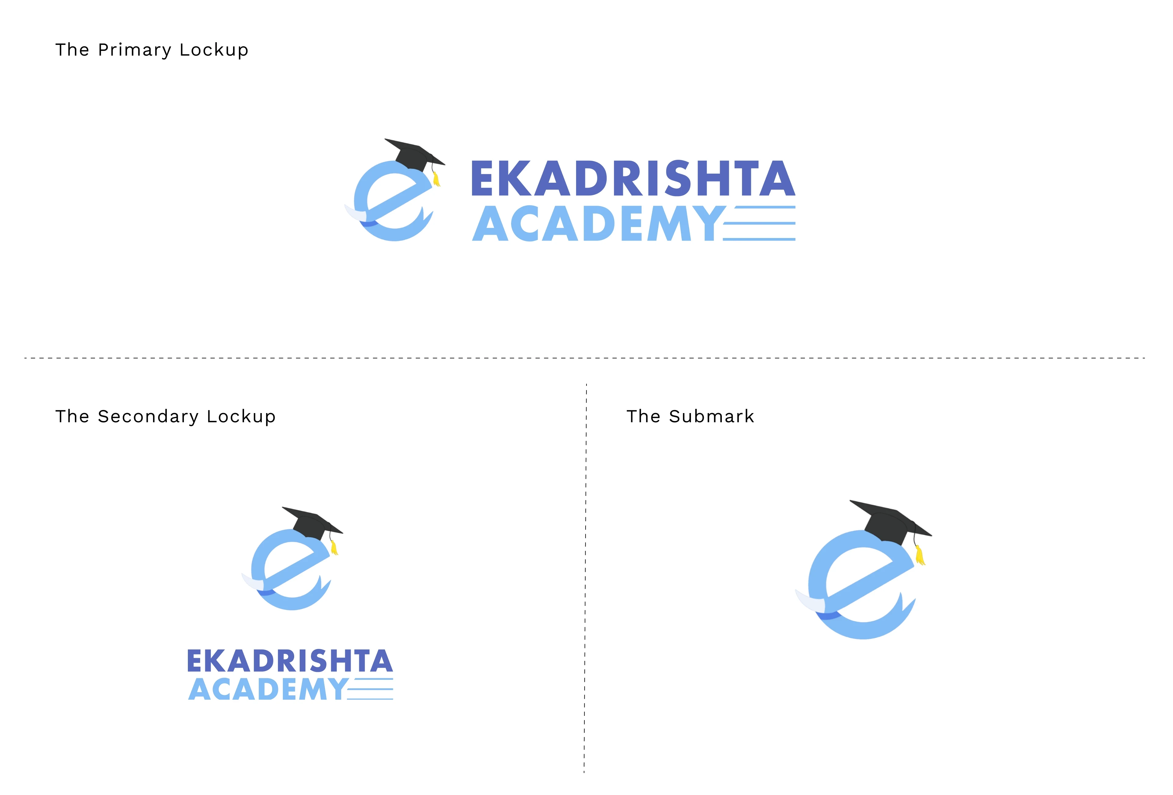
The Submark ‘e’
The submark 'e' takes center stage within our logo. It's not merely a representation of our brand name, 'Ekadrishta Academy,' but also encapsulates our brand's core essence. 'Ekadrishta,' meaning 'Single-tusked Lord,' is one of the many revered names of Lord Ganesha, the elephant-headed deity symbolizing wisdom, prosperity, and good fortune in Hindu culture.
The lowercase 'e' in our submark pays homage to this divine figure, whom we look to for wisdom and guidance, and here is brought forth in the context of our educational pursuits. If you observe closely, the two ends of the 'e' gracefully extend and transform, mirroring a 'single tusk' and a 'trunk,' while a graduation cap gently rests on the right side of the 'e.' This subtle addition symbolizes the path we aspire to embody – a journey of education and knowledge.
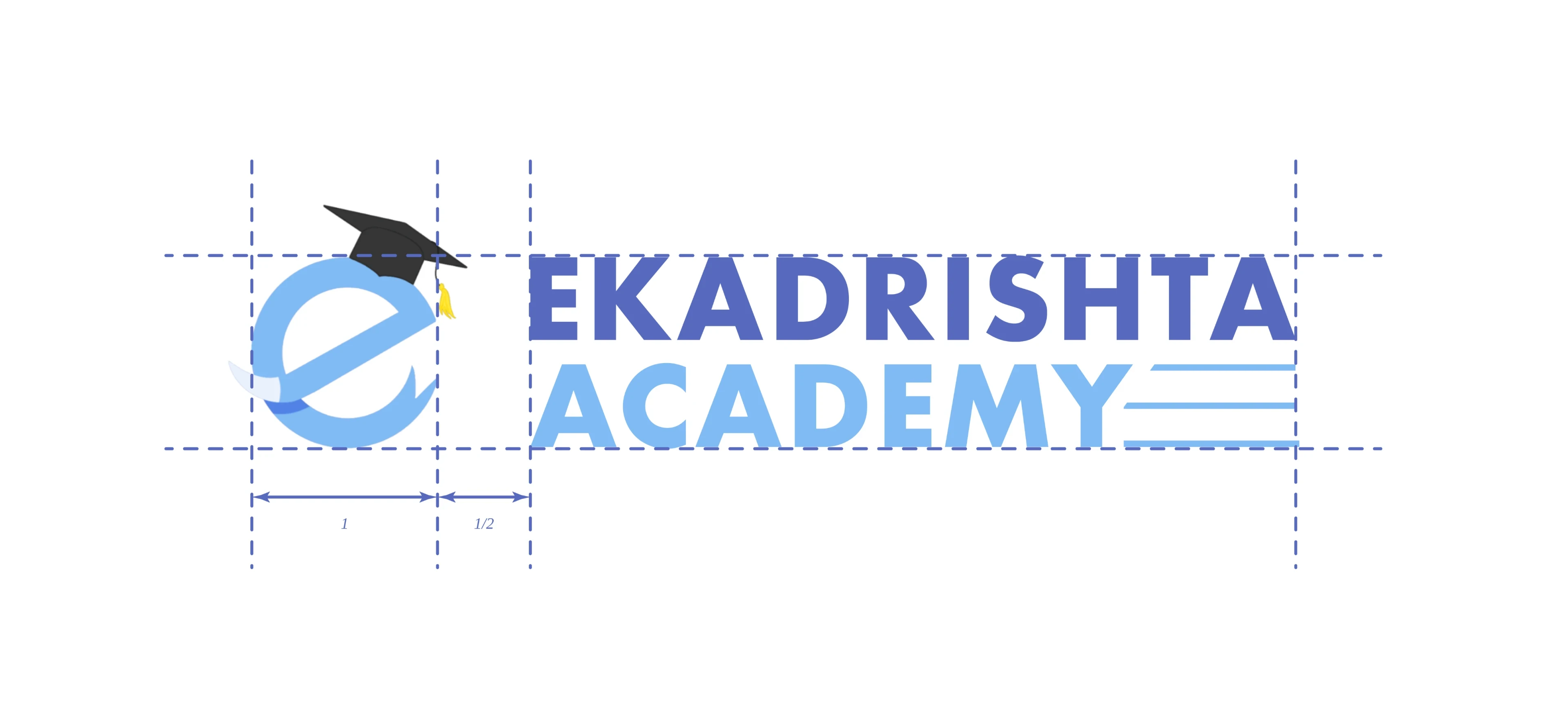
The Construction
Our brand logo embodies a meticulous geometric design, evident in both the submark and wordmark components. The submark, in particular, undergoes a thoughtful construction process, blending curves and straight lines to form a circular shape. However, this precision is artfully disrupted towards each end, where the rigid structure gives way to create a distinct tusk and trunk shape. This playful deviation mirrors the spirited nature of Lord Ganesha.
As for our wordmark, it exclusively features the Futura typeface. Futura, designed by Paul Renner and introduced in 1927, is a renowned geometric sans-serif font. Its clean lines and geometric precision complement our brand's aesthetic, imparting a timeless and modern appeal.
Color Palette
As an educational institution committed to knowledge, trust, and sincerity, our brand color palette is a visual testament to these principles. Predominantly, we have chosen shades of serene blue and pure white to establish a sense of reliability, trustworthiness, and sincerity.
The Process


Thank You.

