
The Missing Apron
The Missing Apron is a playful cookbook inspired by a husband's comical quest to bake a birthday cake, only to realize his missing apron was on his back all along. Rooted in this lighthearted story, the book is designed to make cooking feel approachable and unintimidating. With hand-drawn illustrations and a consistent layout, it guides readers through each recipe with ease and charm.
Year
2022
Tools Used
Procreate, Adobe Illustrator, and Figma
Deliverables
Cover art design Story and narrative direction Page layout and visual hierarchy Illustrated all recipes and supporting visuals Content integration and illustration composition End-to-end book design and production


The Design Journey
The Story Guiding the Design
At the heart of "The Missing Apron" lies a heartwarming tale of a goofy husband's attempt to surprise his wife on her birthday with a birthday cake. The husband, unaccustomed to the kitchen, bravely dons an apron, and starts gathering all the ingredients needed to bake the cake while looking for the endless recipe on the phone. Somewhere in the middle of the process of gathering ingredients, he becomes overwhelmed, and soon realizes that his apron had gone missing.
Then he frantically starts looking for the apron and creates a huge ruckus, prompting his wife to wake up from her sleep. To her amusement, she discovers that her husband is fuming to find the apron that he is currently wearing, and it's only that this time, he is wearing it on his back like a cape.
The Intention with the Design
The design journey began with the tale of a first-time cook—a husband, overwhelmed by the prospect of cooking but determined to conquer this quest for love. This narrative steered the design process, giving birth to a cookbook that prioritizes user-friendliness.
The design's core intention was to ensure that cooking feels approachable for everyone, regardless of their skill level. To achieve this, the cookbook incorporates vibrant, colorful illustrations and maintains a consistent page structure format. These elements work harmoniously to transform the cooking experience into a delightful and achievable task, making every chef feel at ease.
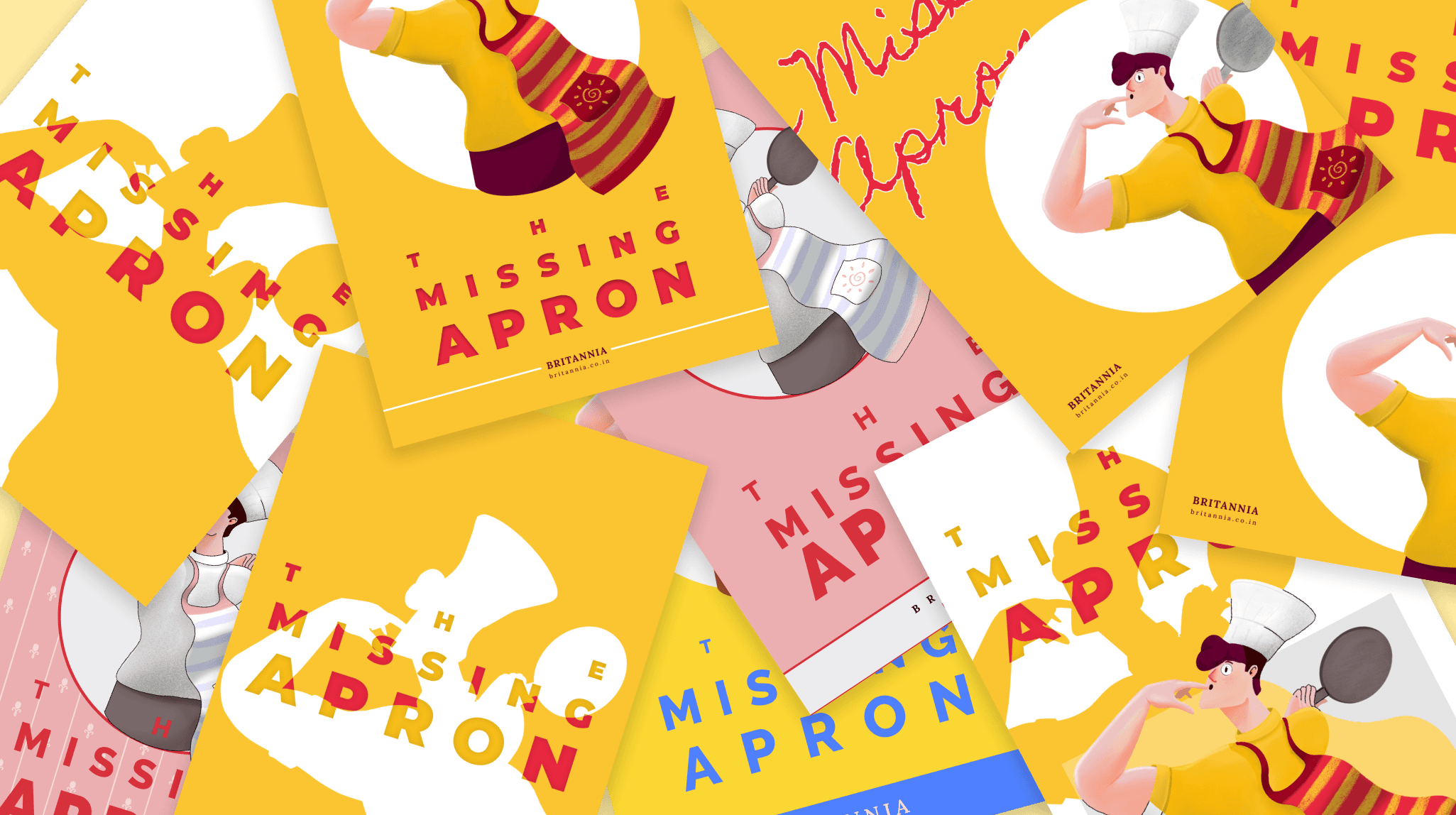
The Cover Design
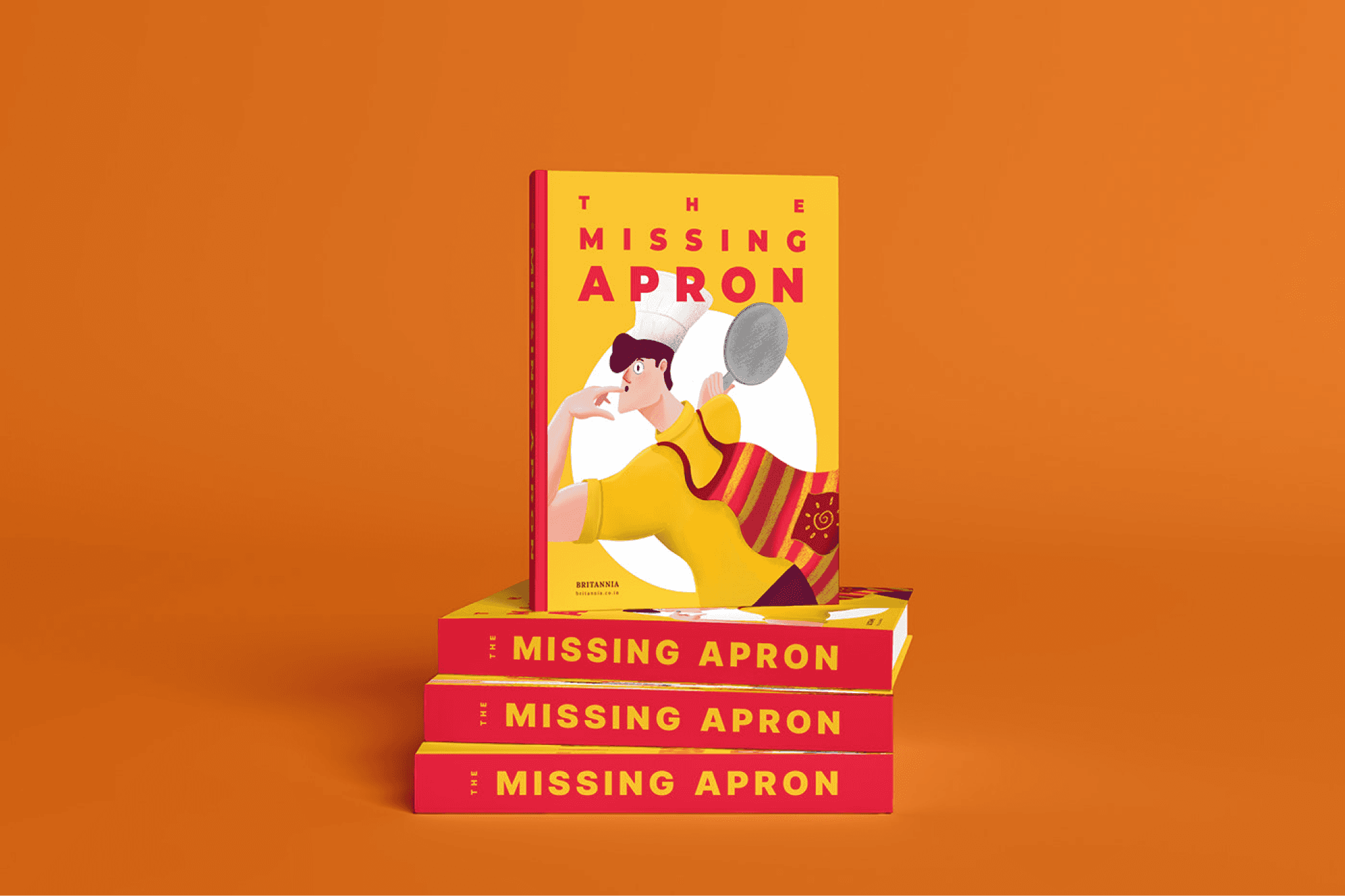
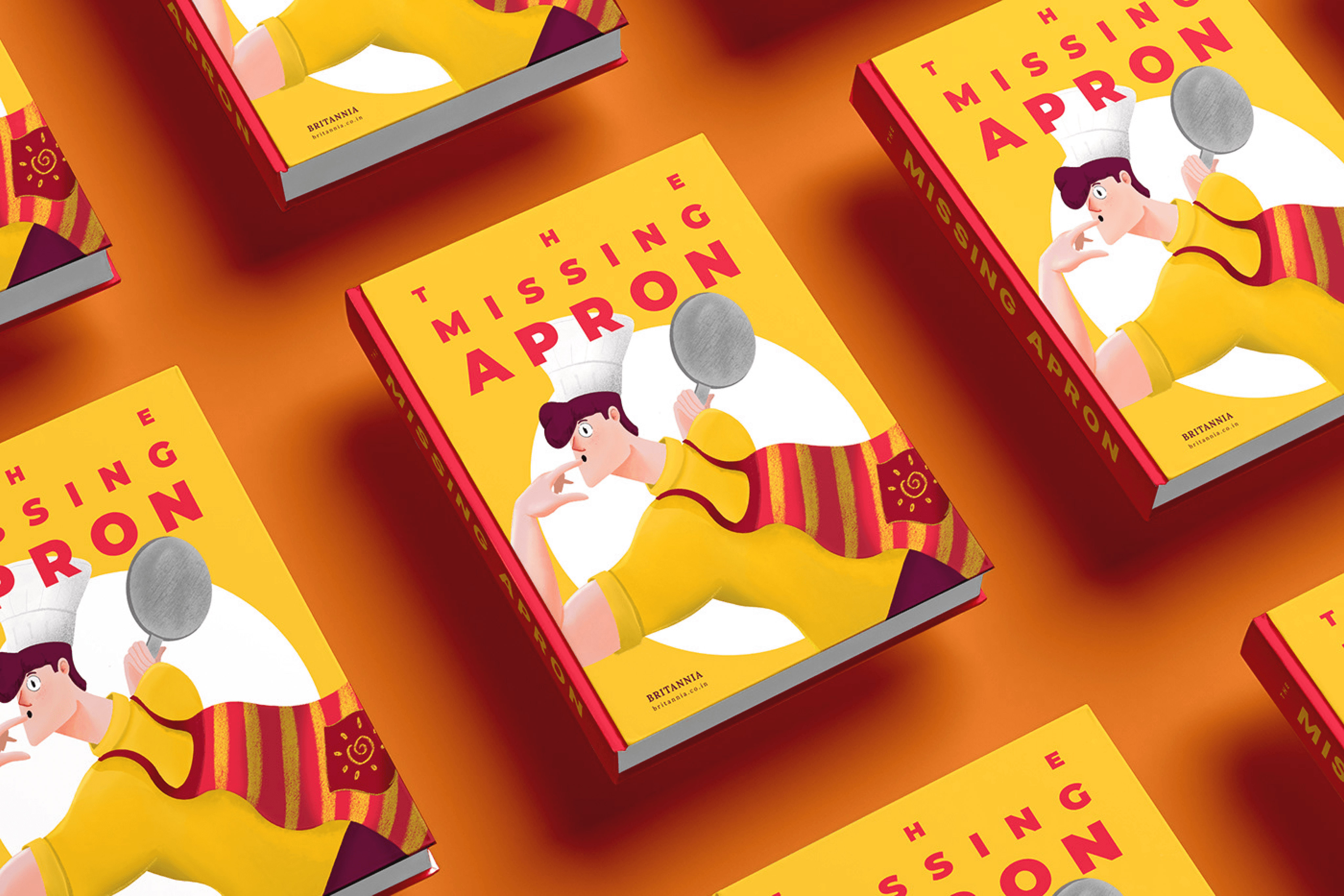
The book cover for "The Missing Apron" reflects our story of the goofy and novice husband diving into cooking. It captures the playful moment with the husband's puzzled face, wondering where the apron is as the apron hangs on his back like a cape.

The Page Structure
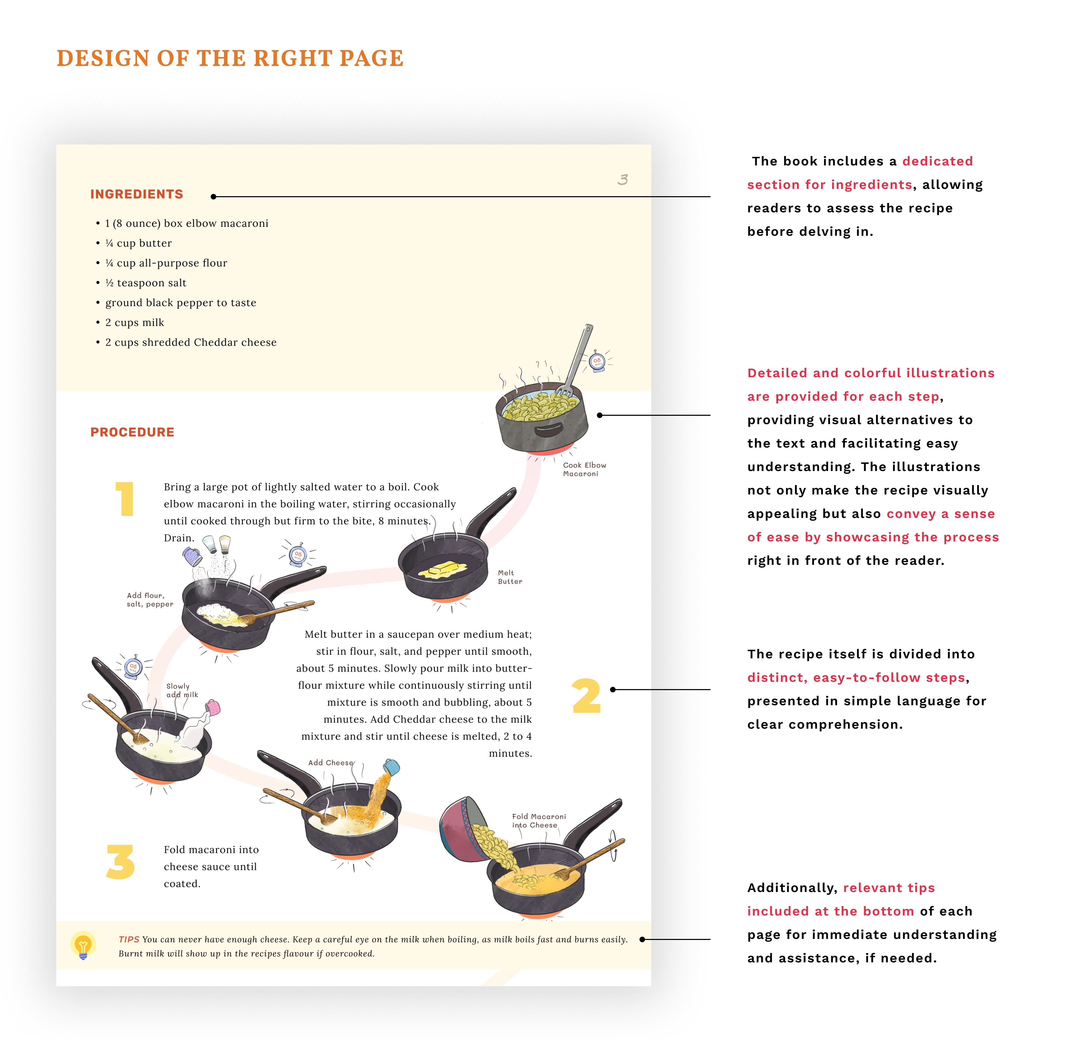
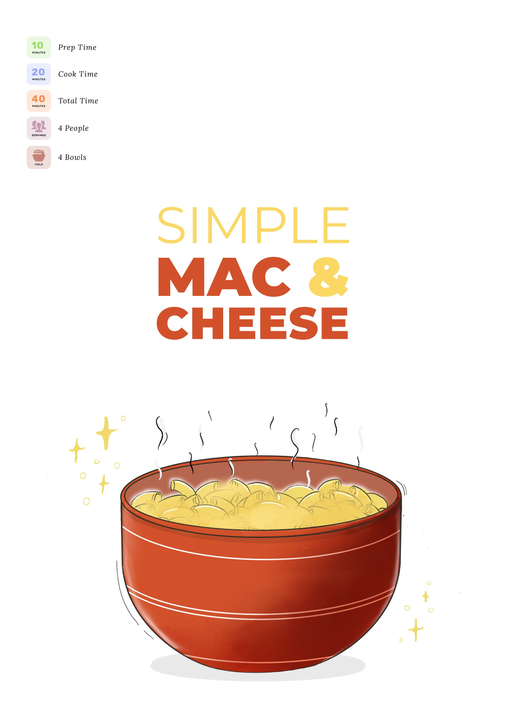
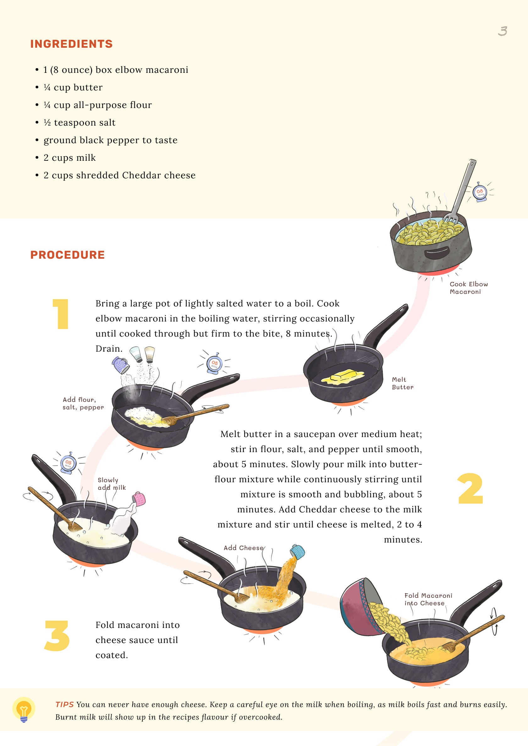
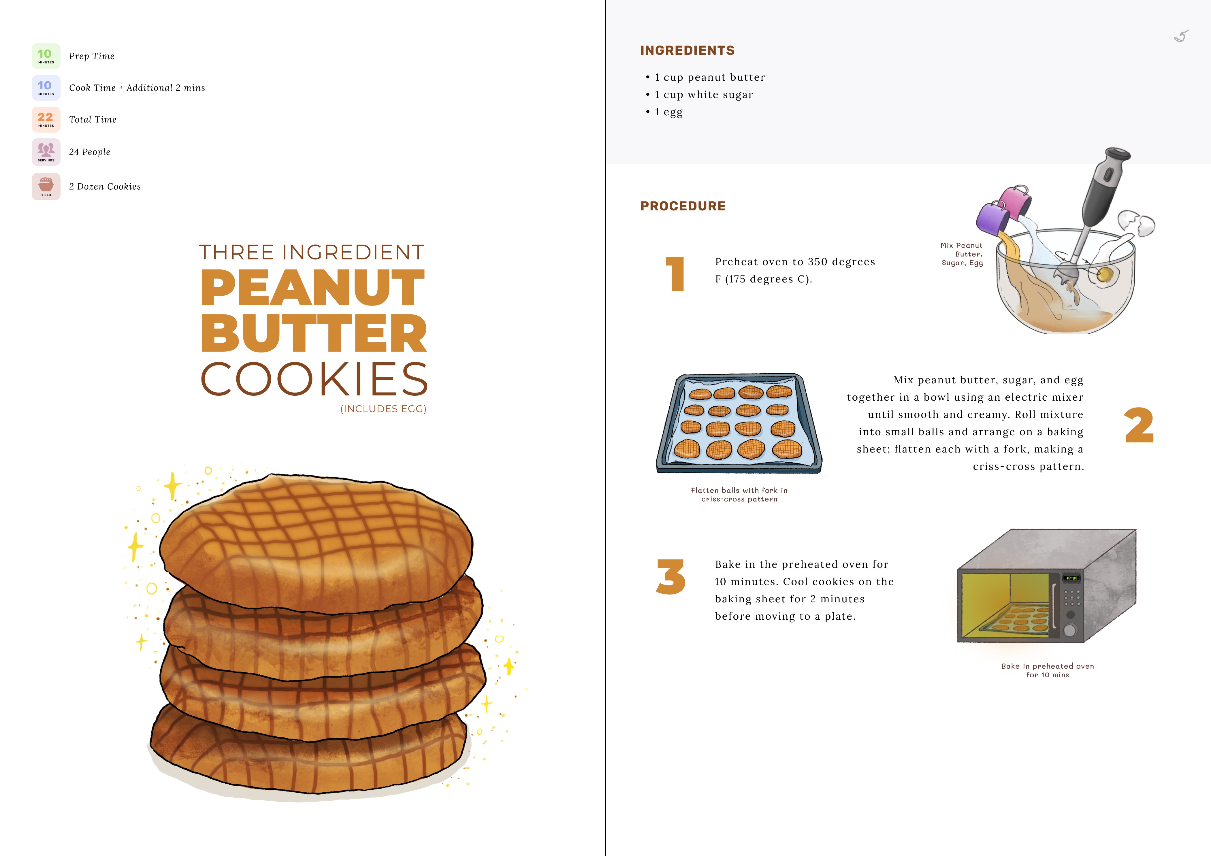
Our Cook Book prioritized accessibility through key design decisions: a vibrant color palette, detailed step-by-step illustrations, clear page layout, legible typefaces, concise instructions, visual aids and imagery, user-friendly format, and approachable language. These choices ensure that readers of all backgrounds and abilities can easily engage with the cookbook and embark on their culinary adventures with confidence.

A Few Glimpses


Rough Drafts
Thank You.
The Design Journey
The Story Guiding the Design
At the heart of "The Missing Apron" lies a heartwarming tale of a goofy husband's attempt to surprise his wife on her birthday with a birthday cake. The husband, unaccustomed to the kitchen, bravely dons an apron, and starts gathering all the ingredients needed to bake the cake while looking for the endless recipe on the phone. Somewhere in the middle of the process of gathering ingredients, he becomes overwhelmed, and soon realizes that his apron had gone missing.
Then he frantically starts looking for the apron and creates a huge ruckus, prompting his wife to wake up from her sleep. To her amusement, she discovers that her husband is fuming to find the apron that he is currently wearing, and it's only that this time, he is wearing it on his back like a cape.
The Intention with the Design
The design journey began with the tale of a first-time cook—a husband, overwhelmed by the prospect of cooking but determined to conquer this quest for love. This narrative steered the design process, giving birth to a cookbook that prioritizes user-friendliness.
The design's core intention was to ensure that cooking feels approachable for everyone, regardless of their skill level. To achieve this, the cookbook incorporates vibrant, colorful illustrations and maintains a consistent page structure format. These elements work harmoniously to transform the cooking experience into a delightful and achievable task, making every chef feel at ease.
The Cover Design
The book cover for "The Missing Apron" reflects our story of the goofy and novice husband diving into cooking. It captures the playful moment with the husband's puzzled face, wondering where the apron is as the apron hangs on his back like a cape.
The Page Structure
Our Cook Book prioritized accessibility through key design decisions: a vibrant color palette, detailed step-by-step illustrations, clear page layout, legible typefaces, concise instructions, visual aids and imagery, user-friendly format, and approachable language. These choices ensure that readers of all backgrounds and abilities can easily engage with the cookbook and embark on their culinary adventures with confidence.
A Few Glimpses
Rough Drafts
Thank You.